

A business sends dozens of emails a day to customers, suppliers and partners. The signature under these emails is often the most consistent and most repeated “business card” the company shows. Even so, in many businesses signatures differ from person to person: one writes a single line with a name, one uses three different typefaces and a rainbow logo, one leaves the phone number out.
In this article we explain what a corporate email signature should contain, design and technical rules, logo and image use, the subject of the legal note, a copyable sample template and a checklist. This article is not legal or financial advice; for the information that should be present in business correspondence, we recommend consulting your financial adviser or lawyer.
Why Is an Email Signature Important?
The signature is a space that repeats your brand on a small scale at the end of every email. Prepared correctly it does three jobs. First, it gives trust: full name, title, company name and contact information let the recipient know whom they are writing to. Second, it makes communication easier: phone, website and address let people reach you without writing a second message. Third, it provides brand consistency: all emails from the same company look the same.
Irregular signatures do the opposite: they weaken the perception of professionalism and can lose customers through missing information. Especially for sales, support and management teams who write outward often, a standard signature is a visible benefit gained with a small investment.
Information a Signature Should Contain
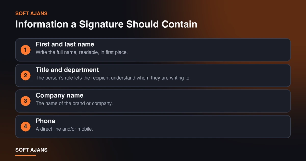
A corporate signature should be short but carry the necessary information. The basic information is:
First and last name. Write the full name, readable, in first place.
Title and department. The person’s role lets the recipient understand whom they are writing to.
Company name. The name of the brand or company. If there is a logo, it should be consistent with the logo.
Phone. A direct line and/or mobile. If you correspond internationally, write the country code.
Website. A single clean address. It should be clickable.
Email address. Even though it appears in the sender field, adding it to the signature helps in printed or forwarded emails.
Address. A short address if there is a physical office or branch. It may not be needed for a remote business.
Social media. Only for active, corporate accounts, a few at most. Do not add unused accounts.
An optional call. A small button or text: “Book an appointment”, “Ask for a free preliminary analysis”. Use only a single call.
Putting in too much information makes the signature unreadable. The measure is that it can be understood at a glance.
Legal Note and Required Information
In business correspondence there can be legal requirements about company information; for example, information such as the trade name, trade registry and MERSIS number may be expected to appear in correspondence. Which information must be in the signature can change with your company type and activity, and regulation can be updated. For exact information on this, turn to your financial adviser or lawyer.
Some companies add a short confidentiality note under the signature stating that the email contains confidential information and should be deleted if it arrived by mistake. Get advice from a legal adviser about the legal binding force of such a note; also the note should not be too long, because a long text under every email is not read and is annoying on mobile. Personal data processing and notice requirements are also legal matters; have the text prepared by an expert.
Design Rules
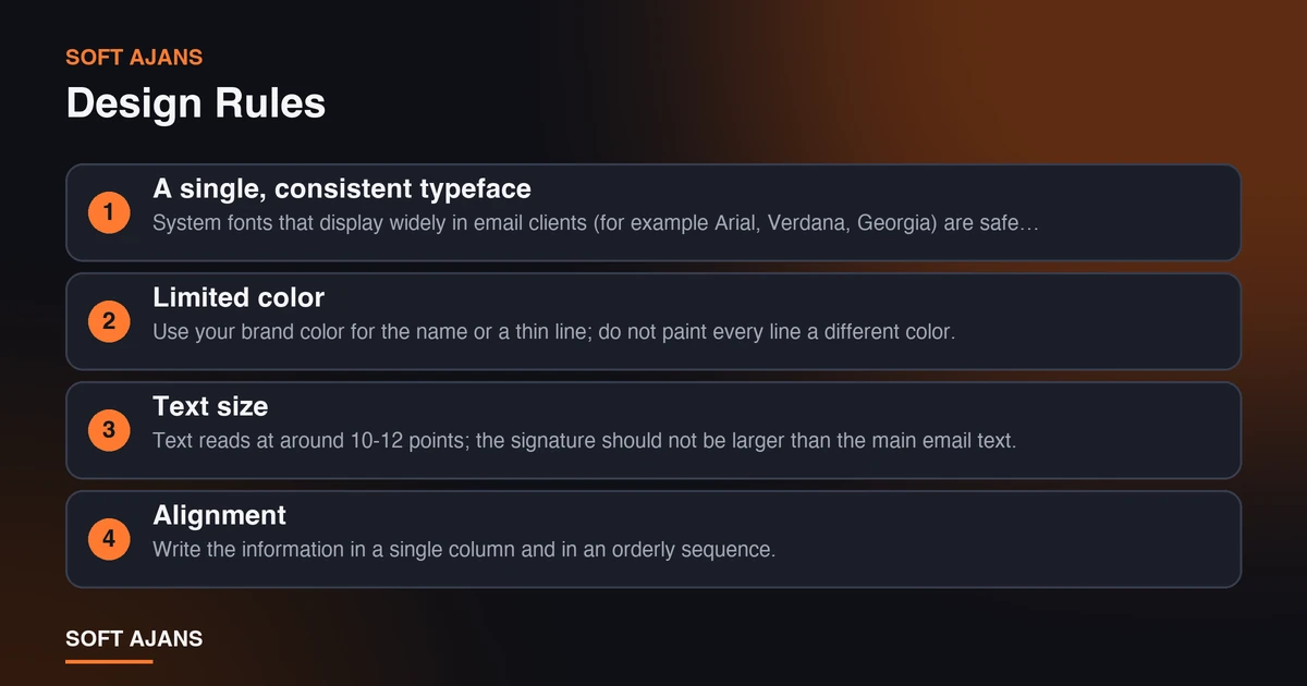
A signature is a small area; keep the design simple and orderly.
A single, consistent typeface. System fonts that display widely in email clients (for example Arial, Verdana, Georgia) are safe choices; if a custom font is not installed on the recipient’s side, another typeface shows.
Limited color. Use your brand color for the name or a thin line; do not paint every line a different color. Make sure there is enough contrast between text and background for readability.
Text size. Text reads at around 10-12 points; the signature should not be larger than the main email text.
Alignment. Write the information in a single column and in an orderly sequence. Complex multi-column tables can break on mobile.
Spacing. Leave breathing room between information groups; a cramped signature is not read.
Separator. Separate the message text from the signature with a small space or a thin line.
If you have a corporate identity guide, the signature should be consistent with it. We explained digital applications of identity such as the email signature in our article on what corporate identity design includes.
Logo and Image Use
A logo adds trust to the signature but causes problems when used wrongly.
Keep it small and light. A logo in a signature usually needs only a few hundred pixels in width. Keep the file size small (kilobyte level); a big file makes the email heavy.
Keep it sharp. To avoid looking blurry on high-resolution screens, prepare the logo at a larger size than shown and display it scaled down; but check the file size again.
Suitable format. PNG works well when a transparent background and sharp lines are needed; JPEG suits photographs. Not every email client shows all formats the same way, so test in several clients.
Add alternative text. Many clients block images by default. Add a short alternative text (the brand name) to the logo so the information shows even if the image does not load.
Do not embed information in an image. Do not put the phone number or address in as an image; if the image does not load the information disappears, and it cannot be clicked or made accessible. Contact information must always be present as text.
Do not use a giant banner. Putting a wide campaign image in the signature can make the email look like spam and takes up space on mobile.
Readability on Mobile
A large share of emails is read on phones. After preparing the signature, try it on a phone: does the text overflow, is the logo too big, can the phone number be tapped to call? A single-column and short layout is the structure that causes the fewest problems on mobile.
Links being large enough and separate from each other makes tapping easier. Giving the phone number as a clickable link allows direct calling on mobile.
Tracking Links
The website link in the signature can be tagged to measure visits that come through email. That way you see how many visits come to the site from the signature. We explained how to set tagging up in our article on what UTM parameters are.
The point to watch is that the tag is used only on the link that comes to the site from outside and that all employees use the same tag. Otherwise data scatters. Also, very long and complicated links can make the signature look broken; use a short page address.
A Sample Template
The template below is fictional; fill the bracketed fields with your own information.
[First Last Name] [Title], [Department] [Company Name]
T: [phone number] E: [email address] W: [website] [Short address, if any]
[Small logo] · [LinkedIn] · [Instagram]
[Optional single call: “Ask for a free preliminary analysis”]
To make the template standard inside the team, choose one of these methods: one person prepares it and distributes the same format to everyone, or use an email service that offers central signature management. If you leave everyone to set it up by hand, consistency is lost.
Steps for Rolling Out a New Signature
- Design the signature and verify the necessary information (title, phone, legal fields).
- Prepare the logo at a small size and with alternative text.
- Send test emails in several email clients (web, desktop, mobile).
- Check that links work and tags are correct.
- Distribute to team members with a short usage guide.
- Update the signature when a new employee arrives or a title changes.
- Review the signature every six months: are the phone, address and social media still correct?
Corporate Email Signature Checklist
- Name, title and company name are correct and readable.
- Phone, email and website are clickable.
- A single typeface and limited color were used.
- The logo is small, sharp and has alternative text.
- Contact information is as text, not in an image.
- There is no overflow on mobile and the phone number can be tapped to call.
- Advice was taken from an expert for legal requirements.
- If there is a confidentiality note, it is short and expert-approved.
- Links are short and, if needed, tagged.
- The whole team uses the same template.
- It was tested in more than one email client.
- A date for periodic updating was set.
Signature Differences for Different Roles
Every employee’s signature should have the same layout, but the content may carry small differences by role. Sales and support teams may bring forward a direct line and working hours, managers a title and direct contact information, the finance team the official information of the company. What matters is that the difference stays in the content and the design is the same.
Putting a personal mobile number in the signature may not suit every employee; leave it to the person’s choice and company policy. If there is a company phone line, prefer it. Writing such decisions as a short rule in the signature standard document also guides new employees later.
Common Mistakes
- An overly long signature. A signature that has to be scrolled in every email is annoying.
- Many colors and typefaces. It creates distraction instead of professionalism.
- Embedding information in an image. If the image is blocked, the phone and address disappear.
- Big files. Heavy logos and banners slow the email down and create spam risk.
- Unused social media accounts. An account that is not updated reduces trust.
- Leaving old information. An old phone or title misdirects the customer.
- Everyone using a different signature. Brand consistency is lost.
- Adding a long legal text. It is not read and takes up space on mobile.
- Not testing on mobile. A signature that looks fine on desktop can break on a phone.
What Does Soft Ajans Do in Corporate Identity Applications?
In our corporate identity design service we prepare digital applications such as the email signature as part of the identity, tied to the logo, color and typeface system. In our logo design service small-size logo versions to be used in the signature can be included in the delivery files.
We do not give legal advice on legal requirements and we give no result guarantees. You can ask for a free preliminary analysis by describing your need.
Frequently Asked Questions
What should a corporate email signature contain?
Name, title, company name, phone, email and website are the basic information. Optionally an address, active social media accounts and a single call can be added. Consult an expert for legal requirements.
Should I put a logo in the email signature?
You can; it should be small, sharp and light, and alternative text should be added. Contact information should not be embedded in an image but be present as text.
What size and format suit the signature?
A logo is usually enough at a few hundred pixels in width. PNG is good for sharp lines and a transparent background. Keep the file size small and test in different clients.
Should all employees use the same signature?
Yes, using the same template provides consistency. Personal fields (name, title, phone) change; the layout and look stay the same.
Is it mandatory to add a confidentiality note to the email signature?
Whether it is mandatory and what it contains is a legal matter. If added, it should be short and prepared with the approval of a legal adviser.
How do I track the link in the signature?
By adding a campaign tag to the website link, you can see visits coming from the signature in Google Analytics 4. All employees need to use the same tag.