“We had a logo made, so our corporate identity is done” is a sentence that is not true for most businesses. A logo is the most visible part of a corporate identity, but not the only part. If the same company has one color on its business card, another on its website, a different typeface in its proposal file and a completely different visual language on its social media profile, what exists is not an identity but pieces that do not resemble each other. The customer notices; most of the time without knowing “what it is”, they just feel it is “scattered”.
In this article we explain what corporate identity design includes, in ten parts: you will see the job of each part, when it is needed and how it should be written in a quote. The aim is not to sell an identity package; it is to let you answer the question “what does corporate identity mean and which do I need?” For a general view of the subject you can also look at the importance of logo and corporate identity design; here the subject is the content and scope itself.
What Is the Difference Between a Logo and a Corporate Identity?
A logo is the signature of a brand: a single mark or form of lettering. A corporate identity is the system that determines how this signature will be used everywhere. The logo answers the question “what”, the identity answers “how”: which colors, which typefaces, which spacing ratios, what appearance on which medium.
A practical analogy: the logo is a person’s face, and the corporate identity is that person’s dress style, way of speaking and all of their behavior. The face makes them recognizable; the style makes them remembered and trusted.
This difference is reflected in the budget too. For a new business that only needs a logo, a logo package may be enough; for companies that appear on several media (printed documents, web, social media, the field) and where several people produce materials, an identity system and a guide are needed. If you want the logo separately, you can look at our logo design service; this article covers the identity side.
The Basic System: Logo, Color and Typography
The first three parts of the identity are the foundation on which everything else rests.
1. Logo and logo variations. A single logo file is not enough. You need horizontal and vertical layouts, an icon-only version, color variations for light and dark backgrounds, and a single-color (black or white) version. Each is useful in a different place: horizontal on a business card, a square icon on a social media profile photo, a white version on a poster with a dark background. The clear space around the logo and the minimum usage size are also determined.
2. Color palette. A main color, secondary colors and neutral tones, with code equivalents for each (for screen and for print). Color choice depends not only on taste but also on legibility: the contrast between text and background colors must be sufficient. Color decisions for the web should be considered together with the principles in choosing the right color palette and typography for a website.
3. Typography. Typefaces for headings and body text, weights and usage rules. The licensing of typefaces matters too: some typefaces are not free or can be used only on certain media; the right of use for print and web should be clarified as part of the identity package. A fallback list of system fonts should also be defined so that the look does not break if the typeface cannot load.
When these three are ready, all remaining materials speak the same language. In an identity where the basic system is missing, every new material becomes a job where everything has to be decided from scratch, and consistency scatters over time.
Corporate Stationery: Business Card, Letterhead, Envelope and Folder
Printed and official materials are the most tangible counterpart of the identity.
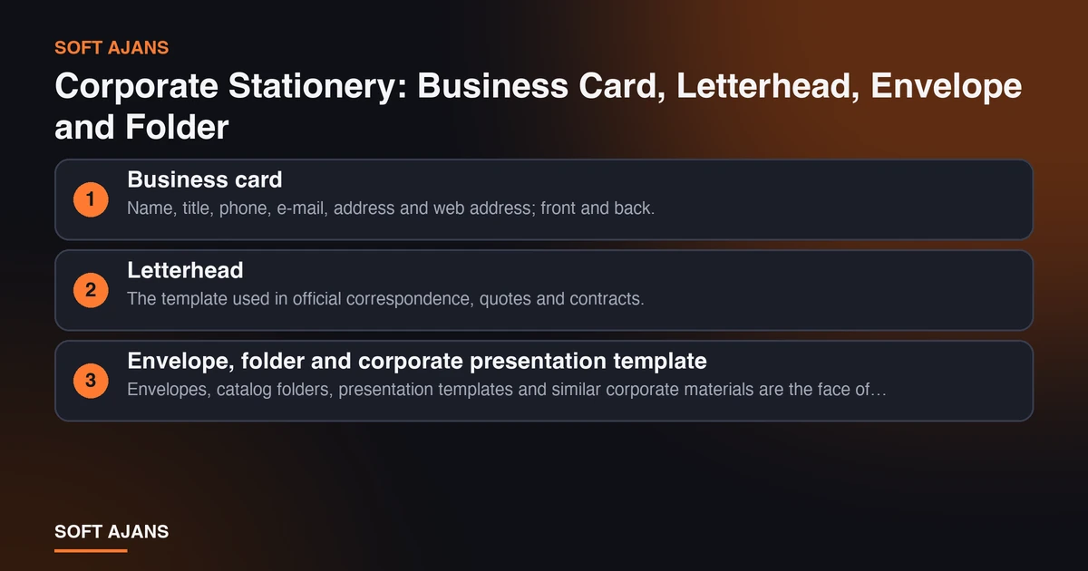
4. Business card. Name, title, phone, e-mail, address and web address; front and back. Legibility and a plain layout come first. Elements such as a QR code, as the digital counterpart of the card, should be added only if they really work.
5. Letterhead. The template used in official correspondence, quotes and contracts. The logo, company title, address and contact details are fixed; the content area must be wide enough. If it will be used digitally (PDF, Word), file format and typeface consistency are critical: the letterhead should look the same on different computers.
6. Envelope, folder and corporate presentation template. Envelopes, catalog folders, presentation templates and similar corporate materials are the face of the identity seen in the field. It is important to think of the presentation template separately: it is one of the materials most visible in sales meetings.
For each of these parts, the print file and the digital file are prepared separately; color mode, resolution and bleed are set for print. Printing is generally quoted separately from design; ask whether printing is included in the quote. If you are thinking of a printed catalog, see what determines catalog design prices for price items and how to prepare a product catalog for preparation.
Digital Identity: E-Mail Signature, Social Media and Web
Today a brand’s first encounter is often digital; so the digital parts of the identity matter as much as the printed ones.
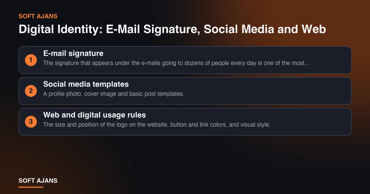
7. E-mail signature. The signature that appears under the e-mails going to dozens of people every day is one of the most seen corporate materials. A name, title, phone, web address and a small logo are enough; heavy signatures with many images can break in e-mail clients and trigger spam filters. Having the signature template the same for all employees ensures consistency.
8. Social media templates. A profile photo, cover image and basic post templates. Each platform has different dimensions; having ready templates in these sizes in the identity package prevents re-deciding in every post later. If you will manage social media regularly, for the content side see what social media management is.
9. Web and digital usage rules. The size and position of the logo on the website, button and link colors, and visual style. A website is an application of the identity; color and typography decisions must match the site. If you are planning a new site, see pages a corporate website needs for which pages it should have and 10 things to prepare before you order a website for the process.
The Brand Guide: Usage Rules of the Identity
10. Brand (identity) guide. The document that explains how the logo, colors, typefaces and other elements are to be used; it is the “user manual” of the identity. A good guide contains:
- The variations of the logo, clear space, minimum size and uses to avoid (changing colors, squeezing, skewing and the like).
- The color palette and codes (screen, print), and which color is used where.
- Typography rules, heading and body hierarchy.
- The layout of the business card, letterhead, e-mail signature and social media templates.
- Visual style: short guidelines for the use of photos and icons.
- Contact details: whom to ask if a question about the guide comes up.
The guide is the part that extends the life of the identity. As the company grows, different people and different designers prepare the materials; without a guide each adds their own interpretation and consistency scatters. The scope of the guide (a short usage page or a comprehensive document) varies by package and should be written in the quote.
Delivery Files: Which Format Is for What?
Identity materials are not finished just by being designed; they must be delivered in the right formats. Each format has a different area of use:
- Vector files (AI, EPS, SVG, PDF): Source files that do not lose quality at any size. Needed for print and large-format uses; printers generally ask for these.
- PNG (transparent background): Used on the web, in presentations and in digital documents.
- JPG: For photo-heavy uses that do not need transparency.
- Print-ready PDF: A print file for materials such as business cards and letterheads, with bleed and color settings done.
- Digital use files: The e-mail signature template, social media templates, the presentation template.
Have the formats to be delivered written in the quote. Source files (the “raw” form of the identity) are important so that you can make updates in the future; whether source files will be handed over to you should be stated in the agreement. To reduce the size of images in digital use you can use our image compression tool, which runs in the browser.
The Process: How Is an Identity Built From Brief to Delivery?
A corporate identity project generally follows this order:
- Brief and understanding of the brand. What the company does, whom it serves, how it wants to be positioned, examples liked and disliked. The clearer this step, the fewer rounds the design needs.
- Concept and logo. If a new logo is needed, concepts are prepared; if the existing logo will be used, simplification and a variation study are done if necessary.
- Color and typography system. The basic system is built and approved.
- Applications. The business card, letterhead, envelope, folder, e-mail signature and social media templates are designed according to the system.
- Guide. The usage rules are turned into a document.
- Delivery. The formats are prepared, files and the guide are delivered; if there is print, the files are checked for print.
The duration depends on the scope, the number of materials and the speed of feedback. Getting approval at each stage and collecting revisions in a single list shorten the time. Renewing an existing identity is also possible: a more current and consistent identity can be built while keeping the core values of the brand. For the general framework of the process, the logic of reading quotes in how to compare web design quotes applies to identity projects too.
Price and Scope: Our Packages in October 2026
The items that set the price are the number of materials to be prepared, whether a new logo is needed, the number of revisions and the scope of the guide. On our corporate identity design page three packages are written; as of October 2026 their scope is:
- Starter Package (6,000 TL, one-off): Logo and a basic color and typography system, business card and letterhead design, 2 revisions.
- Professional Package (12,000 TL, one-off): In addition to the Starter Package, a full corporate stationery set (envelope, folder and so on), digital identity applications (e-mail signature and so on) and a brand guide.
- Corporate Package (20,000 TL, one-off): In addition to everything in the Professional Package, an extended set of corporate materials, a comprehensive brand guide and unlimited revisions.
If you want only a logo, the logo packages are separate (as of October 2026, 3,000, 5,500 and 9,000 TL; the scope varies by the number of concepts, revisions and delivery formats). Prices are kept up to date on the page; the above is a dated summary. The standard service generally covers design; printing can be quoted separately. Social media templates (profile, cover and basic post) can be added to the package; the number of revisions is stated in the chosen package.
10 Items to Look for in a Quote
When evaluating an identity quote, check these ten items:
- Is a new logo included, or will the existing logo be used?
- Are logo variations (horizontal, vertical, icon, single color) delivered?
- Is the color and typography system written, and are typeface licenses clear?
- Which corporate stationery materials are included (business card, letterhead, envelope, folder, presentation)?
- Are digital applications (e-mail signature, social media templates) included?
- Is there a brand guide, and how extensive is it?
- How many revisions are included and what is their scope?
- Which file formats are delivered, and will the source files be given to you?
- Is printing included or separate?
- Are the duration and payment plan tied to stages?
Get the answers in writing. To bring quotes to the same base, you can use the method in bringing three agency quotes to the same base, and for a ready table the agency quote comparison table.
Common Mistakes
- Mistaking the logo for the identity. If stationery, digital materials and a guide are not prepared after the logo is made, consistency scatters.
- Having each material made by a different person. Giving the business card to one designer, the website to another and social media to a third produces different languages without a shared guide.
- Not taking the source files. Without vector and source files it is hard to update later; the logo may remain only a low-resolution image.
- Not asking about typeface licenses. An identity designed with a paid typeface can cause problems in print or on the web if there is no license.
- Seeing colors only on screen. A color that looks good on screen can come out different in print; take a test print before printing.
- Skipping the guide. The guide looks costly but is the part that protects the long-term consistency of the identity.
What Does Soft Ajans Do in Corporate Identity Design?
In our corporate identity design service, we build the logo, color and typography under a consistent system; prepare corporate stationery such as business cards, letterheads, envelopes and folders in line with the brand language; make sure the identity looks consistent in e-mail signatures and digital materials; and gather the usage rules in a brand guide. Vector, print-ready and digital usage formats are delivered. For printed materials such as a product catalog you can look at our catalog design service, and for the application of the identity on the website our web design service.
If you would like to clarify your identity needs together, you can contact us; to see the state of your digital assets, you can request a free pre-analysis.
Frequently Asked Questions
What does corporate identity design cover?
It can cover materials such as the logo, color palette, typography, business card, letterhead, envelope, folder, e-mail signature, social media templates and brand guide. Which of them are included in the package varies by the chosen package and should be written in the quote.
I had a logo made; do I also need a corporate identity?
If you appear on only a single medium, the logo may be enough. If printed documents, web, social media and field materials are used together, an identity system and guide protect consistency. An identity package can also be prepared with your existing logo.
Can I renew my existing corporate identity?
Yes. A more current and consistent identity can be built while keeping the core values of the brand. Sharing your existing files and sample materials lets the scope be set correctly.
Is a corporate identity guide mandatory?
It is not mandatory, but it is very valuable if more than one person or company will produce materials. The guide puts in writing how the logo and colors are to be used and protects consistency in the long term.
Is printing included in the identity package?
The standard service generally covers design; printing can be quoted separately, or a print-ready file is delivered. Ask clearly in the quote whether printing is included.
How long does a corporate identity take to prepare?
The duration depends on the scope, the number of materials and the speed of feedback. If the brief is clear and feedback is collected in a single list, the process is shorter. The schedule should be written in the quote.